


Starting to create a website? Awesome! Before you get started, check out this article that'll help you make your website better and easy for everyone to use. It's a win-win, boosting your SEO, making your content user-friendly, and accessible to all.
Content structure
As we all know content is the most important part of your website, so, it needs to be structured in a logical way that is easy to read and offers the most to your users.
Headings
Headings enable users to skim through the content and find what they're looking for easily. But, also users who are using assistive tools can use shortcuts to skip over content easily. Thus, make sure to follow these:
A page must have only one unique
<h1>(heading one) tag that describes the content of this page.The other headings are used to create sections and structure the rest of the content.
Headings must be used in order, meaning that
<h3>(heading three) tag should not be used before<h2>(heading 2).If the paragraphs are removed, the headings should form a proper table of contents found in textbooks.
Outline
The next step of content structure is the outline and the proper use of semantic elements such as <nav> for navigation, <main> for the main part of the page, etc. Using these elements will automatically create region landmarks for your page. Landmarks give information about the way that your page is structured visually in a programmatical way to assistive tools. Furthermore, it ensures that screen readers do not overlook important information on your page, or overload the user with too much information.
<!-- Don't do this-->
<div id="container">
    <div id="article">
    </div>
</div>

<!-- Do this: -->
<main>
    <article>
    </article>
</main>
Apart from the semantic elements, it is possible to create region landmarks by using the role attribute. However, use this only in the cases where the built-in semantic elements do not match with the use case.
Keyboard access
Some users depend on a keyboard to be able to access the content of your site; while many users prefer shortcuts and the speed that the keyboard offers. Therefore, it is important to set the correct hierarchy:
Arrange and order the DOM elements in a logical order (ideally following the way they are visually present).
Make sure that elements that are not visually not visible, cannot be accessed via keyboard (a typical example of this is the menu navigation).
Usedisplay: noneorvisible: hiddento hide elements.The region landmarks mentioned earlier, provide shortcuts to assistive tools that enable users to navigate quickly, e.g. the key
Hreads the headings only etc.Avoid using floating positioning as it will break the keyboard focus order
Ensure that the focus outline is present and easily noticable.
Labels and image alternative text
Images, icons and other visuals are very common and needed to convey information, or simply give a certain look & feel to your website. However, without alt text, search engines do not have this information, neither do assistive tools. Alt text improves greatly SEO of your site and user experience to screen reader users. To provide a good UX to all users, the alt text should be concise and describe the content of the image in a way that fits the context it is being used.

Acceptable alt text: <img src="./assets/kitten.png" alt="A kitten seated on a bed"/>
Not recommended alt text: <imgsrc="./assets/kitten.png" alt="Blue-eyed kitten seated on a bed with white sheets and two pillows close by with peach colors background and two water bottles in the background"/>
When writing alt text avoid:
describing every single detail of the image (remember screen readers will read all this text and deteriorate UX).
using words like "Picture of", "An image of" etc., assistive tools already have the information from the
<img>element.adding the same text as the image caption (remember: the captions describe the context of why this image is used, whereas the alt text describes the image itself).
On the other hand, it is common in sites to use visuals that do not provide any further context and are simply there to make your website more visually appealing. In this case, make sure to hide this from assistive tools by either using role="presentation" or aria-hidden=true.
Color contrast
Colors are an important part of your website design, so choosing the right colors with appropriate contrast will make your content easily readable without eye strain to your users. The standard is to follow the WCAG 2.1 guideline which states that:
for normal size text, the color contrast should be 4.5:1 ratio
for bold and heading-size text, the color contrast should be 3:1 ratio
there is no guideline for hover states
The contrast ratio can be easily determined by using the dev tools or other online tools.
Tap target
Last but not least, as more and more devices are getting touch screen capability, it is important that the controls in your site have enough spacing that is easily tappable. The WCAG 2.2 guideline states that the tap target should be equivalent to a minimum 24px diameter imaginary circle if drawn on top of the control, for example:
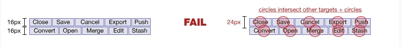

The control can appear smaller and still follow this guideline, the easiest way to achieve this is to adjust the padding and/or margins of the control. An exception to this guideline are the browser/device native controls which are not possible to be modified such as date pickers, color pickers etc.
Hope you enjoyed this short article. Any feedback is highly appreciated 🌟!
Happy coding 👩💻!
Resources
Interested to read more? Here are some great resources:
Landmark regions: https://www.w3.org/WAI/ARIA/apg/practices/landmark-regions/
Tap target guideline: https://www.w3.org/WAI/WCAG22/Understanding/target-size-minimum.h
Color contrast: https://hashnode.com/post/ckyd6iin701ko8hs1897ybzmt
Keyboard access: https://hashnode.com/post/ckyx41s6d02ul2qs1d8zp7mi9